


Designer Leo Nickolls: Interview
- 17th September 2019
- Category : Blog,Interviews & Blogs
2.602K
3
likes
Leo Nickolls is the designer behind the cover of A Matter of Interpretation. We’ve talked to him about his path into graphic designing and his creative process.
How did you get into the arts and what led you to graphic design?
I grew up drawing comics and generally had a bit of passion for all things illustrated. I was supposed to go to Brighton to study Media around about nineteen, but as fate would have it, it turned out I was to be a dad a bit sooner than I expected to be in life! So I decided to look locally (I live in Norwich), and signed up for Norwich University of the Arts to study Graphic Design.
You mention on your website that you mostly work on book covers. Have you worked on or would you like to work on designing anything else?
Well, it’s 99% book covers, the only stuff I’ve done outside that realm is an illustration of a priest’s cope for the V&A that was turned into an animation, and I’ve recently started working on interior pictures in books. I love concept art for films and I lean more towards illustration these days. I’m not good enough to be one by a long stretch, but in my dreams that’s what I’m drawing ha ha…
What is your process in producing a book cover?
I once read an interview with another book cover designer called Jamie Keenan who described book cover design as a relatively ‘thoughtless’ process, which has always stuck with me. I think it’s true, in a meditative, instinct sort of sense, I tend to stare at my screen, move things about, add a highlight/shade/colour here and there until I think something fits.
Sometimes you’ll spend ages on something only to find it’s a dead end or you’ve over-complicated, but most of the time you’ll get there eventually.
In terms of the mechanics of designing, it’s usually reading the brief/reading the manuscript, studying the comparable covers on the market, and picture research for key images that’ll need to go on the cover. Once you’ve done all that, the thoughtlessness begins!
Are you a reader yourself? How much (if any) of the book do you need to read before designing a cover for it?
It depends if the publishers asks me to read it, to be honest, I’d say it’s 50/50. Usually the brief takes care of what’s in the book, but sometimes I’m asked to go through it to get a personal feel for it. I wouldn’t say I’m a bookworm as such, pretty much all of the reading I do is in manuscript form, and by the time I get home after work, I kinda don’t want to read anymore ha ha… (That sounds terrible from a cover designer, doesn’t it? Mostly I love the medium, it’s such a great, fertile area creatively to work in.)
How hard is it to follow someone else’s guidelines to create the designs? Is there anything clients could do/stop doing to make your work easier?
The only ‘bugbears’ I have (relatively speaking, it’s not like I sit at home or my studio fuming about it!) are if the brief is vague, or if the brief shifts regularly ad hoc once the project has started. For obvious reasons it can tend to make working on it somewhat trickier, not least because there are a lot of ‘back to the drawing board’ feedback emails involved. All of which can sometimes mean there’s more work gotten out of you than the fee’s worth, if that makes sense?
Also, something I call ‘project creeping’, which is when (often as a result of the above) the publishing schedule either changes, or isn’t spelt out to you in the first instance when you take on the job. My current record for getting final payment for a finished project is sixteen months. Anyone who knows what the average fee is for a designer/illustrator like me knows that the money against that turnaround can make revenue somewhat tricky!
Generally though, I don’t find it hard at all if the guidelines are nice and clear.
When working, do you prefer to be given artistic space to ‘do your thing’?
Kinda depends on the job, I suppose! Usually if a brief entails reading the manuscript then I like to have a bit of freedom to create something that’s my take on the atmosphere of the story. Otherwise, a little supervision is never unwelcome, I’m not precious about my work, and I like a bit of collaboration, especially if you get stuck on something (sadly creativity doesn’t c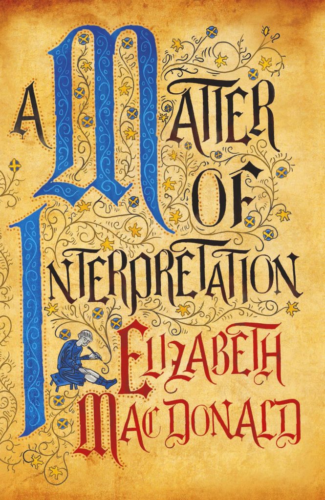 ome on tap).
Could you walk us through your working process creating a jacket for A Matter of Interpretation?
I’ve done a few illuminated manuscript-style covers in my time so I have enough references to work from for a project like this one. My only challenge is to make it look different from the other ones I’ve done, and make it look like an illuminated manuscript whilst maintaining a look that’s saleable!
Do you sketch your ideas by hand or using software?
I sketch and draw, but I do it directly in photoshop on a digital tablet called a Cintiq.
What makes a great book cover for you?
Something original, something visually arresting/sensitive to the story, something tactile, and a neatly summed-up concept that isn’t over- dressed. How often I achieve that I can’t say (I can never judge my own work), but that’s what it’s all about, I’d say.
What has been your favourite cover to make/which one are you the proudest of?
I’m very proud of Ocean at the End of the Lane, purely because it’s for one of my favourite authors. And The North Water. Otherwise, favourites tend to change year on year as you develop in experience/technique etc. I think.
Your designs seem full of movement. What or who, you find, inspire them?
I’m very inspired by concept art for film these days, I think it’s a highly unsung form of art. And I find new illustrators every day that give me goosebumps (an illustrator I’ve come across recently called Sam Wolfe Connelly makes the most beautiful haunting images, I’m highly envious of his talent). I find that a good incentive to keep you hungry and enthusiastic about upping your game.
Do you have a favourite book genre to design for?
Anything fully illustrated. Preferably a bit gothic/ethereal.
Can you see any book-cover trends around the world at the moment that you especially enjoy/dislike?
In my eleven/twelve years designing book covers, it seems quite cyclical to me. Type intertwining with the image or being obscured by certain parts comes and goes and comes back again all the time, handmade-looking covers seem pretty perennial to me. I can’t say I dislike any particular trend to be honest. You might hear me groan a bit if I read a brief that includes covers I’ve seen countless times over the last few months in other jobs, but not massively so, it is what it is!
Do you have a dream book you’d love to design a cover for one day?
Philip Pullman’s His Dark Materials trilogy, Neil Gaiman’s Neverwhere, Alan Garner’s Owl Service, and a book called The Giant Under the Snow by John Gordon. And any of JG Ballard’s books. There’s a few ha ha…
What are you working on at the moment?
I’m working mostly on Young Adult illustrated stuff at the moment (I tend to lose count a bit, and I’m rubbish at keeping diaries or writing on calendars!), apart from that a book about Algae, the final chapter in a trilogy by Andrew Caldecott called Lostacre, a really cool-sounding book about shape-shifting women, but mostly YA stuff (the kinda stuff that wouldn’t be out of place being adapted for Netflix series).
To find out more about Leo visit his website.