


- Home
- Interviews & Blogs
- Illustrator Rui Ricardo: Interview
Illustrator Rui Ricardo: Interview
- 29th August 2017
- Category : Interviews & Blogs
3.326K
3
likes
Based in Porto, Portugal, Rui Ricardo is the book cover illustrator of Lou Gilmond’s The Tale of Senyor Rodriguez. Well known for his vintage-style imagery, he has published his own graphic novels as well as collaborated with such famous names as The Times, Virgin, Tommy Hilfiger and Samsung. We have chatted to Rui about his designs, what it is like to be an illustrator and his collaboration with Fairlight Books.
How did you get into art & design and what led you to book illustrating?
I’ve enjoyed drawing ever since I can remember, spending hours playing with crayons. Later on, I went to art school, then to Fine Arts University to study Graphic Design. It was what I’ve always loved doing the most so the process came naturally. I earned my first commission at the age of fifteen so I’ve been doing this for quite some time. Although book covers are my favourite, I do all sorts of illustration jobs – editorial, magazine and record covers, ads, posters, corporate logos and signs.
What do you enjoy or dislike the most about book illustrating?
I love books and I read as much as I can. Doing book covers brings two of my main passions together so it’s very enjoyable for me. I get very excited every time I get a new book to work on, so I can’t think of any particular aspect that I dislike about creating covers. I might get a bit annoyed when, sometimes, the literature is not as good as I hoped – it makes me wish I could be working on a better author’s book, but that’s part of the job! But generally, I do get to work on good covers.
What is your process in producing a book cover?
It depends on the client and the sort of brief I get. I usually receive a few ideas to give me directions on the theme and style. Then I start putting those concepts on paper, making a few preliminary sketches. Once the publisher and author are happy with the concept, composition and type, I move on to the colour stage. After the cover is ready, it may go through a few amends, depending on the client’s comments but sometimes I get it right at the first try. Some briefs I get are very specific, other times I have much more freedom to explore a few different solutions and concepts – it varies a lot.
How much of the book do you need to read before designing a cover?
I really like to read the books before I start to get more involved with the project, but it’s not always necessary. Also, it might not be possible because of the time constraints, or because the client prefers not to send it, and supplies the main ideas and the synopsis instead.
When illustrating, do you prefer to be given artistic space to ‘do your thing’ or to be supervised?
Handling and understanding a brief is very tricky and probably the hardest part of the process. I feel I get much better results when I have total freedom but it may also cause me to go around in circles when a client isn’t happy with the artwork. It’s very important to be on the same page as the art director, the publishers and the author. Having general guidelines helps me understand what the client is after.
The main issue that has persisted over the years is when I’m asked to do concepts or compositions that just don’t work visually. For instance, trying to incorporate too many details might make the cover incredibly confusing and ugly; hermetic ideas that an author has in his head but that aren’t obvious to the general public; elements that are too small or too big to create a nice balance and composition; having huge titles that take half of the cover because of marketing aspects (big letters won’t make a beautiful and appealing cover). It may happen in a thousand different ways. I think it would make my work a lot easier if, sometimes, the publishers would have more trust in the illustrators and designers!
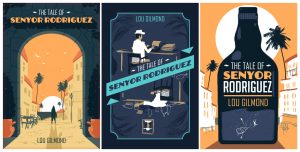
Working on The Tale of Senyor Rodriguez, on the other hand, was very pleasant – I received just the right amount of information and was left with the space needed to develop a cover that I was very happy with.
Could you walk us through your working process to design The Tale of Senyor Rodriguez? How did you come up with the idea?
The whole process was very smooth, comparing to a cover I did before it. I started with three different sketches and one of them was the main composition of the final cover. After finishing the artwork, it just went through a couple of tweaks until we reached the final design.
As far as the concept goes, the illustration needed to portray a British writer in the 60s Majorca, who loves to drink and party. At some point his lifestyle gets out of control, he’s out of money and can’t finish his book. It was important to show the location and the sensation of a hot and sunny place accurately, and the character needed to be ‘placed’ as if he was lost in the old town’s streets. I wanted to give the sense of someone roaming with no particular direction, with a touch of mystery that invites the reader to find out more about this man. The arch in the cover may be seen as a symbol of the man’s entrance into this new place and the experiences that await him.
There was great communication from the part of the author and the publisher and we were on the same page from the beginning. I have to say, when it comes to reaching a concept and getting to the final artwork, Senyor Rodriguez was one of the easiest project I’ve done. After three initial sketches and the artwork stage we went over one batch of a few minor corrections until we had the cover finalised. I usually go through a few more corrections until I get it right and everyone is pleased with the results. I’ve had jobs that needed endless edits but it’s often due to indecisiveness or lack of information on the client’s part.
Do you sketch your ideas by hand or using software?
I usually start by hand, using pencils. For Senyor Rodriguez I did the sketches using digital software because I knew that the colours and the type would be major aspects of the cover. Pencil sketching is a lot easier and quicker for trying new concepts and ideas but it often misleads the client due to the monochromatic tones. In this case, I felt I needed to work with the colours from the start.
One other concept I had for this project was the image of the protagonist writing and getting drunk at night. I gave the author and the publisher two very different visual concepts for the cover so it was important to have the right colour tones there. One cover would be a day scene with warm orange tones, the other – a night scene with blue tones.

What makes a great book cover for you?
In my opinion, a good cover must have a simple concept that visually captures the ambiance of the book, keeping a good, balanced composition that will be graphically appealing. It has to make you want to know what’s inside the story without exactly revealing what’s going on. Besides, it depends on the subject and the genre of the book. Covers of mystery and sci-fi novels will need some aspects that are completely different from one another. At the same time, the cover needs to be fresh and original so it’s not always a good idea to follow the rules that are seen in similar books. When I work on books that were published before, I research a lot and check the previous covers or covers of books in the same genre. I do this to make sure I stay away from what’s been done before and to try make the new cover as different as possible. It’s important and a lot more challenging for me to try and keep as original as possible.
Which one of your covers are you the proudest of?
This is really tricky because I’m never completely happy with my own work. Even if I’m satisfied with a cover once I finish it, there’s always something I wish I had done slightly different, when I look at it after some time. I keep making mental notes on aspects that I have to perfect on the next job so it’s an ongoing process in the search of the perfect cover/illustration. Maybe I’m too hard on myself but I’d say my favourite cover will be the next one. That is, until I finish it and move on to the next!
Do you have any favourite artists, designers or illustrators that inspire you?
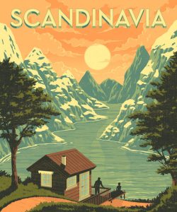
Yes, but there are so many different ones that I couldn’t possibly mention all those who had inspired me over the years on different graphic aspects. From Miroslav Sasek to Raymond Savignac or Daniel Clowes. Classic artists like Toulouse-Lautrec or Hokusai – I’ve been studying his later work intensively over the past months. All the poster artists from the Golden Age, advertising from the 40s, and WWII or North Korean propaganda posters, despite their message! More recently, I’ve discovered Darwyn Cooke’s series Parker which I find amazing.
Can you see any book-cover trends around the world at the moment that you enjoy?
I have to confess that I’m mostly interested and inspired by things that passed the test of time – I rarely spend much time checking trends. One style might be trendy today and turn obsolete next year. I tend to get amazed with Egyptian hieroglyphs or ancient Greek vases, or a Gauguin, rarely with contemporary artists and designers.
Have you noticed an overall change in the style of the covers you are commissioned to work on over time?
Not really. I usually get commissions due to my ‘new retro’ style (although I don’t like the term, it’s what most people call it), and that doesn’t change with trends. I’d say there has been a change orientated to make the covers work both on paper as on a screen. So, it’s not really the style that has changed, more the layout and composition. Covers tend to be more clean and simple to avoid complex shapes when seen in smaller sizes.
Do you have a dream book you’d love to design one day?
I dream of doing a complete J.G. Ballard’s collection or illustrating a compilation of his short stories. He’s one of my favourite authors and I feel none of his covers have ever been as good as the books. Fingers crossed!
What are you working on at the moment?
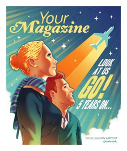
I have quite a few projects on my hands. I’m working on three British magazine covers, a British wine logo, two beer labels for an American brewery based in Vietnam, posters for a printing convention in Shanghai, an editorial commission for the US but no book covers at the moment.
To find out more about Rui Ricardo visit his website or Folio Art.
Want to find out more about publishing professionals? Check-out our interview with a ghostwriter Teena Lyons here.