


- Home
- Interviews & Blogs
- Cover Designer Sara Wood: Interview
Cover Designer Sara Wood: Interview
- 3rd July 2018
- Category : Interviews & Blogs
3.191K
2
likes
Sara Wood is a book designer based in New York City. She has created the design for the Fairlight Moderns series (out 11 July, 2018). Sara has shared with us how she got into book design, her work process on the Moderns series, the many people that inspire her work, and her dream book to design.
How did you get into art & design and what led you to book design and illustration?

I’ve always been fairly artistic, and, thankfully, my family was very encouraging. By the time I got to high school, I knew that instead of applying to a more traditional university, I wanted to attend art school. I ended up studying illustration at the University of the Arts in Philadelphia, and it’s there that my desire to work in book design really solidified. As soon as I discovered that I could build a career out of reading and designing, I knew that I’d found my calling. I moved to New York immediately after graduation and started in entry-level positions at Oxford University Press and Penguin. As I worked my way up I took freelance assignments to better flesh out my portfolio, and I currently work as an associate art director at HarperCollins.
Do you only work on book design and illustrating?
Book design and illustration has been my main focus for the past 8 years, but while I was in school I also took fairly constant freelance work designing gig posters. That was actually a great preparation for a career in book design. Book covers and gig posters serve a fairly similar purpose: to provide information in an eye-catching and memorable way.
What is your process in producing a book cover?
It changes slightly depending on the book, but every project always begins with the text. I’ll read whatever materials are available, keep a list of key imagery or visual symbols that might appear throughout, and then I’ll start to sketch thumbnail versions of my early ideas. Thumbnail sketches are small and efficient – they don’t have to be perfect, but they help me to quickly figure out the broad strokes of a composition and work out any potential challenges before I turn on my computer. The rest of the process tends to be digital. Often I’m researching images from stock photo sites like Getty, I’m seeking out the work of artists who might create art for the cover, or I’m creating that artwork myself (first on paper with ink or paints, then scanned and manipulated digitally). It all depends on the needs of the text.
How much (if any) of the book do you need to read before designing a cover?
I do feel the need to read as much as I possibly can. I phrase it that way because not every manuscript is fully finished or edited by the time the publishing schedule requires that the cover be designed. I find that reading the original material fully and carefully makes my job immeasurably easier, particularly when the book is a work of fiction. Stepping into the world that the author has created gives me all of the tools that I need to visually welcome other readers into that world.
How hard is it to follow someone else’s guidelines to design covers?
I am happy to report that this dynamic has been a fairly rare one for me, but conflict between design and editorial can manifest itself when a designer (me!) is trying to get away with something a bit unconventional or adventurous on a cover. I will still try to push the envelope whenever I can, but it’s always valid to be reminded that a book cover is part of a commercial enterprise; it’s not just art for art’s sake! I will say that one direction that every designer fears receiving is ‘Can you make it look exactly like [insert name of massively bestselling book here]?’

When designing, do you prefer to be given artistic space to ‘do your thing’, or to be supervised?
As with most things, a little bit of both! I follow my own vision when I approach every new project, but whether it’s coming from an art director, an editor, a publisher, or an author, feedback is almost always beneficial to the final design.
Could you walk us through your working process to design the Fairlight Moderns?
I had so much fun with this series. After a really helpful informational phone call, I knew that the Fairlight Moderns would have to be bright and eye-catching, but still look approachable and literary. I also knew that there would need to be room for various bespoke illustrations, so I began with a completely open space, in this case a traditional inset frame with modern, beveled corners. Using the classic design principle of visual hierarchy, I set the logo and series title centered at the top, to establish this series first and foremost as a unified library. With ample space for a unique illustration in the center of the frame, I set the titles and author names in complementary typefaces along the bottom. Throughout this series I wanted to explore the interplay between traditional and modern, to communicate to the reader that they should expect fresh, exciting stories from this series of traditionally printed books.
The staff at Fairlight had also communicated a desire for the spines within the series to line up and tell a bit of a visual story. I thought that this was an excellent idea, and had a great time trying to come up with a repeatable sea wave motif that might reference the lighthouse within the Fairlight Books logo.
How many revisions does it usually take you to finalise the design for a book?
This really depends! Some covers move along and are approved quite quickly, perhaps even in a single round, but most covers tend to go through three or four rounds of revisions. This means that a single cover can have as many as 20–30 options before a final design is chosen.
What makes a great book cover for you?
An excellent question! If a cover manages to represent a very specific world, whether that’s through an eye-catching or emotionally moving photograph or artwork, or through uniquely rendered typography, then it’s a success. A cover must do double duty: on the superficial level, it must draw the eye instantly (from across a bookstore OR from an online retailer), but it must also make the reader linger and want to know more.
What has been your favourite cover to make?
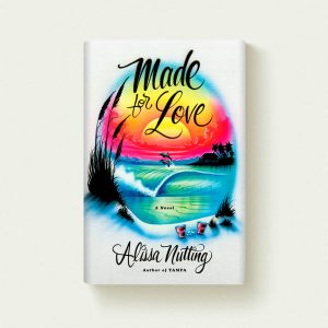
At this point my favourite cover has been one that I designed for Made for Love by Alissa Nutting, published in July 2017. I knew that I wanted to bring the reader into a very specific world, that of a Florida beach town. When I was a kid I remembered admiring the work of the airbrush artists along the beach boardwalks who would create fantastical beach scenes on cotton t-shirts and baseball hats with the flick of a wrist, so I contacted an airbrush stand owner in Orlando, Florida and asked him to recreate a sketch that I had put together of the cover design. We spoke on the phone very briefly, and he seemed to know exactly what I sought. Within a week or two he sent a finished t-shirt featuring my original design, rendered in his very unique and inimitable style. I photographed it and that was that: my favorite cover to date!
Often cover designers aren’t creating the first jacket for the book (i.e. re-issuing, changing covers for different markets). When you’re working on these type of books, do you tend to check the other versions of the cover to get inspiration or do you try and stay away from them?
It’s difficult to avoid seeing the original designs for foreign or out-of-print editions as I’m often reading the original copies to begin my design process. That being said, it can actually be useful to look at the original covers and consider what about them did or did not work, particularly after I’ve read the material. It’s always interesting to think about what might differ between say, American or British audiences, or between readers from the 1970s and today, and how those differences can be addressed on a book cover.
Do you have a favourite book genre to design for?
Not at all! I enjoy designing for poetry and historical fiction as much as I enjoy working on books about cooking or biology.
Do you have any favourite designers, illustrators or artists that inspire you?
I have almost too many inspirational figures to count. I so admire the work of cover designers like Na Kim, Rachel Willey, Janet Hansen, David Pearson, and Oliver Munday. That’s just to name a few! Illustrators like Lauren Nassef, Jillian Tamaki, Amélie Fontaine, Tatsuro Kiuchi, and Jim Tierney (full disclosure: he’s my husband!) fill me with the best kind of jealousy: the kind that leads to motivation.

Have you noticed an overall change in the style of the covers you are commissioned to work on over time?
Not so much in the most recent couple of years, but early on in my career I was perhaps known more for historical women’s fiction than anything else. While these stories were all beautiful and moving in their own ways, the established trends within that genre were fairly consistent, so I have really appreciated the opportunities to work on increasingly diverse cover projects.
Can you see any book-cover trends around the world at the moment that you enjoy?
I love the dovetailing trends towards both minimalism and embellishment. There is something so satisfying about a visual communication that is spare and efficient, but I feel the same amount of joy when I look at a complex, finely detailed cover.
Do you have a dream book you’d love to design one day?
MFK Fisher is one of my favorite writers of all time, so I would love to repackage one of her books. Or maybe even her whole backlist!
What are you working on at the moment and do you have any book-design-and-illustration-related future plans?
The covers that I’m working on now will not be published until the end of this year, but I am perhaps most excited about the cover for a book called Trinity by Louisa Hall. I am not yet able to share the design, but the story is a fascinating and inventive series of fictionalized accounts from people who knew or worked for Robert J. Oppenheimer, inventor of the atomic bomb. The overall effect is a richly detailed portrait not only of a complex and at times tortured public figure, but also of a particularly fraught time in American history. As far as plans go, I merely hope to continue to work on the same sort of challenging and stimulating covers that I have been so lucky to have designed thus far.
For more information about Sara Wood, visit her website.