


Designer Amanda Weiss: Interview
- 24th February 2020
- Category : Blog,Interviews & Blogs
2.643K
4
likes
Amanda Weiss is the designer behind our How-to… Modern Living series. We’ve talked to her about her path into graphic designing and her creative process.
How did you get into the arts and what led you to book design?
I got into art when I was in elementary school, thanks to cartoon shows and anime. Originally, I was planning on getting into illustration or graphic novels, but once I learned about graphic design in high school, I had my ‘aha’ moment.
I’ve always gravitated towards books in general because I enjoy reading, but it wasn’t until later in my life that I realized a good part of it was due to the cover design. I didn’t know book design was even a profession until my senior year of college. I’m very privileged that I was able to get into the publishing industry right out of school.
What is your process in producing a book cover?
I first look over the cover materials, which are normally the manuscript, a cover design form and possibly a marketing launch form. I may receive information on what the author likes and depending on the project, direction from the AD (Art Director) on what type of ideas I should explore. I take time to read at least one chapter of the manuscript and write down any information I think will be useful to reference later. At this point, I start sketching and, once I’m at a place where I’m confident with my ideas, I jump on the computer to refine them further. Throughout the entire process I save covers and graphics for inspiration. It can be very useful to reference when I get stuck or just need a refresher.
How hard is it to follow someone else’s guidelines to create the designs?
Is there anything clients could do/stop doing to make your work easier?
I don’t find following someone else’s guidelines too difficult, because, as most designers will tell you, having no direction tends to be scarier. There’s more room for error and the possibilities are endless. So it’s nice to have some sense of direction. But too much, and then you feel you have no say or can’t be too creative. It’s a happy medium that designers have to find with each client and art director.
When it comes to things clients can do to make my work easier, I wish clients would be more comfortable taking risks with their cover designs. I understand where clients are coming from, as I worked in-house for some time and know they have a lot to work against, but falling back on a safe, expected design isn’t always the best thing for the book.
Something I appreciate clients doing, which seems obvious but isn’t always the case, is when they ask which cover design I prefer and support it during the review process. That lets me know they trust and value my opinion as a designer, which can mean a lot during a project.
When working, do you prefer to be given artistic space to ‘do your thing’ or do you like to be supervised?
This may be optimistic, but I think that I’m normally given enough space during a project. Again, it depends on the art director and the relationship. Sometimes if a project is a bit more tedious or involves sensitive subject matter, I may want some more feedback and guidance during the process.
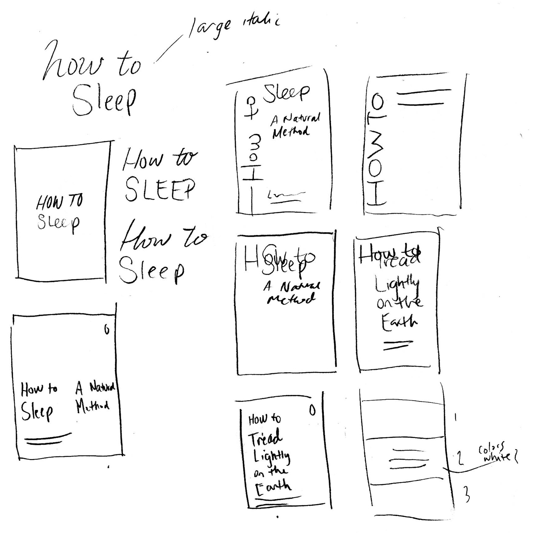
Could you walk us through your working process to design the How-to Series?
Sure. The design for this series was really driven by the content. We knew two of the titles of the books in the series so far, but future variables were unknown, such as the number of authors per book, whether or not each would have a subtitle, and how long (or short) each title could be. So up front, we knew we wanted a design that was very flexible and could also be prepared in-house in the future. This made me avoid using custom illustrations or designing with bespoke treatments that could prove difficult for future titles. We wanted to avoid anything that was too simplistic, and especially ones with a similar title, like Thich Nhat Hanh’s How-to series. I also wanted to keep in mind Fairlight Books’ other series, Fairlight Moderns, designed by Sara Wood, so I could avoid too many similarities.
I was relatively new to the genre of mental health and wellbeing, so I researched what was being done and considered what could be unique. I was drawn to the production and simplicity of the work done by The School of Life Press, which felt very contemporary and new age. Outside of the genre, I was drawn to many other series designs, including the Faber poetry series, a beautiful and straightforward design compromised of only typography and color. This research and inspiration pushed me to use colour to differentiate each book, while keeping the same type structure.
We explored incorporating geometric patterns and more minimal, larger typographic directions, but decided the Lydian/Caslon direction was most successful. The double-line border, paired with Caslon, is very traditional, but Lydian provides a more contemporary and elegant tone. The smaller trim size contributes to the bespoke gift feel, and upon opening, the viewer receives a pleasant surprise from the lined pattern printed on the reverse side.
Which did you use for the How-to Series?
I normally sketch my ideas by hand. It’s a quick way to help me understand if the concept will work or not without investing too much time. Plus, it’s very organic and often leads to new ideas as I go. Depending on the project, I may sketch as little as two thumbnails or as many as six pages. In the case of the How-to series, I knew that the series was going to be mainly type-based, so I only sketched a couple rough ideas. I did the majority of my cover exploration while I was working on the computer.
What’s the longest/shortest time it took you to finalise a cover design?
The shortest amount of time, from when I sent the first covers to the time the author and in-house team approved it, was three days. The longest time was seven months.
What makes a great book cover for you?
Putting my personal taste aside, I think a great book cover needs to:
1) draw a viewer to the book and make them ask ‘What’s that?’
2) be content-appropriate
3) be timeless. There have been more than enough projects where I ask myself, ‘Am I just making this look attractive or does it actually make sense?’. This is why I like to hear what the author and the editor have to say, since they know the book better than anyone.
What has been your favourite cover to make/which one are you the proudest of?
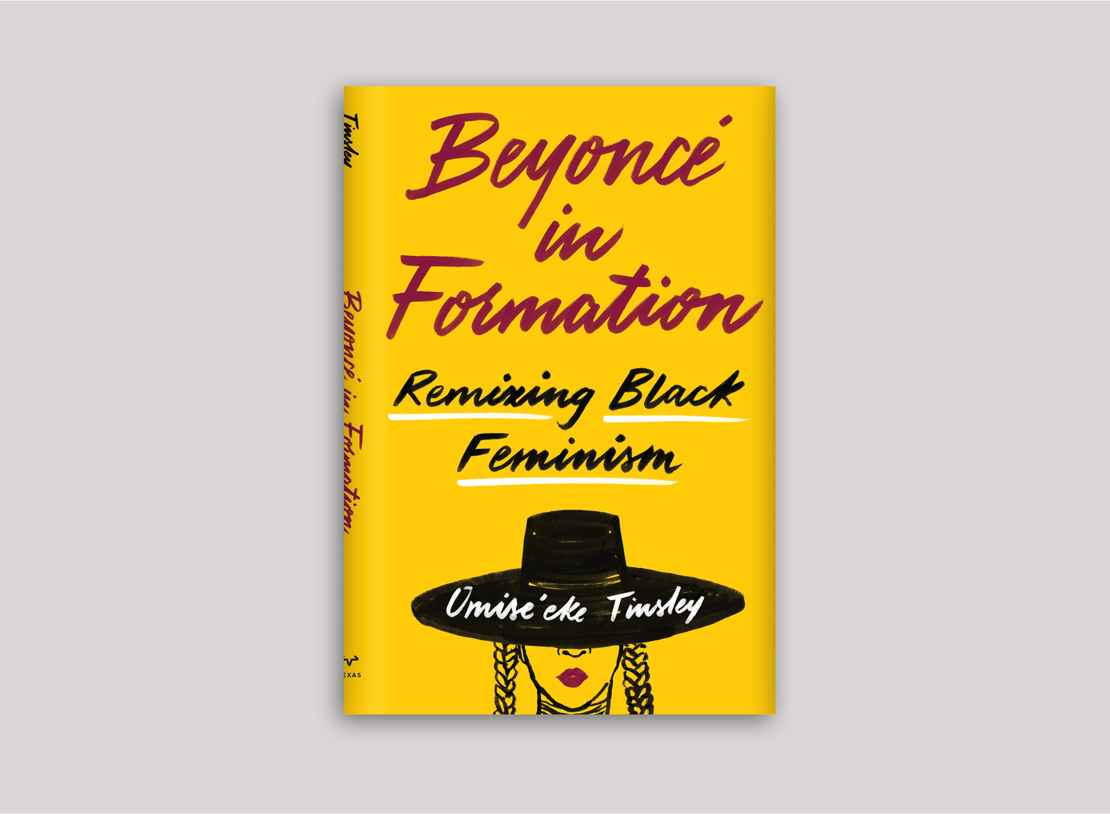
That’s tough! I think my favorite cover that I’ve made so far was Beyonce in Formation. The editor and art director were very trusting in my creative process, and pushed me to do my best work. You can read a very detailed process about it on Spine Magazine.
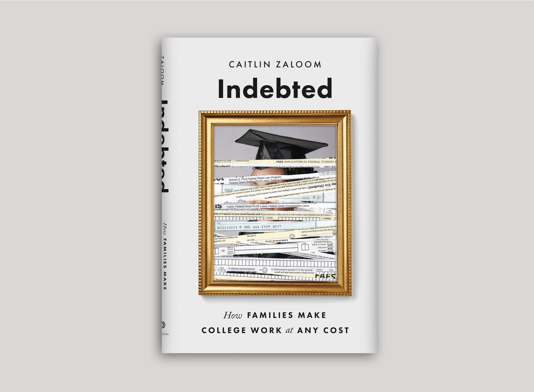
The cover I’m most proud of would have to be Indebted. More conceptual covers aren’t always approved, especially in the university press world, so I was 100% happy with how that turned out.
After receiving a brief to design a cover, do you tend to research books in the same genre to get inspiration or do you try and stay away from them? Why?
I tend to do a bit of both. First I’ll research the covers within the genre, including most recent and older, to get a sense of what’s been done and what is expected. Then I will branch out to other sources for inspiration, both outside the genre and outside book design. Sometimes I get my inspiration from exhibition design, poster design, or package design.
Your designs are usually very vivid and full of colour. What or who, do you find, inspires them?
Thank you! I’d say I’ve been influenced a lot lately by Instagram and discovering illustrators and designers who use lots of bright, RGB color palettes. For example, Jade Purple Brown, Subin Yang, Jordan Sondler, Kotryna Zukauskaite and Temi Coker. The bright color palettes also help me conquer my fear of color theory. I also wouldn’t be surprised if the colorful designs have been a therapeutic response to the depressing news of the past two-three years.
Do you have a favourite book genre to design for?
I tend to enjoy projects that relate to popular science, sociology, pop culture or music, and natural history.
Can you see any book-cover trends around the world at the moment that you especially enjoy/dislike?
I wouldn’t say there’s anything I outright dislike. Large, centered, condensed type interacting with beautiful illustrations has been something I’ve seen float around internationally for the past few years (see Fates and Furies, The Gunners, What Happened?). I’m guilty of doing this and believe it can look really nice if it’s done well.
Collage work also seems to have come back in full swing, not that it ever really went away, which is exciting.
Do you have a dream book you’d love to design a cover for one day?
I’d really like to design the cover and interior of a cookbook one day. It sounds a little mundane, but I love exploring ways to showcase hierarchy and photographs, and I also love food, so it’s a win-win.
What are you working on at the moment?
I’m currently working on covers with a variety of subjects, like how hidden sugars in food affect children’s mental and physical wellbeing; a deeper look at how greed and corruption in democracy led to Trump’s rise in power; and a translated novel about a Korean woman who believes she is the last surviving comfort woman in existence.
To find out more about Amanda, visit her website.
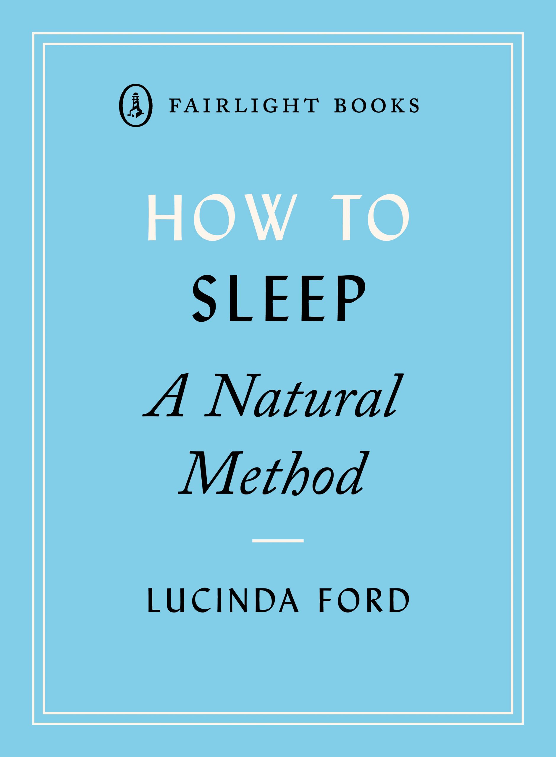
More information on How to Sleep by Lucinda Ford.